
Types of XAUUSD Charts
XAUUSD trading offers three chart types for gold.
Charts are graph representations of the price movement that are drawn on a grid & they can be drawn using different chart time-frames like 1 minutes trading charts, 5 minutes charts, 15 minutes trading charts, 1 hour, 4 hour, daily, weekly & monthly chart time-frames.
A trader will pick the chart's time period for trading based on their own way of trading: for those who trade daily, they'll pick charts showing 15-minute periods, and quick traders will use charts showing 1-minute periods, while long-term traders use hourly charts.
These trading charts can be drawn using different chart representations, these are:
- Line Charts
- Bar Charts
- Candles Charts
Line Charts
The line chart is composed of a single, unbroken line representing the closing price. If utilizing 5-minute charts, the closing price for each five-minute interval is plotted and connected to the subsequent 5-minute close, thus forming one continuous line that defines the line chart.
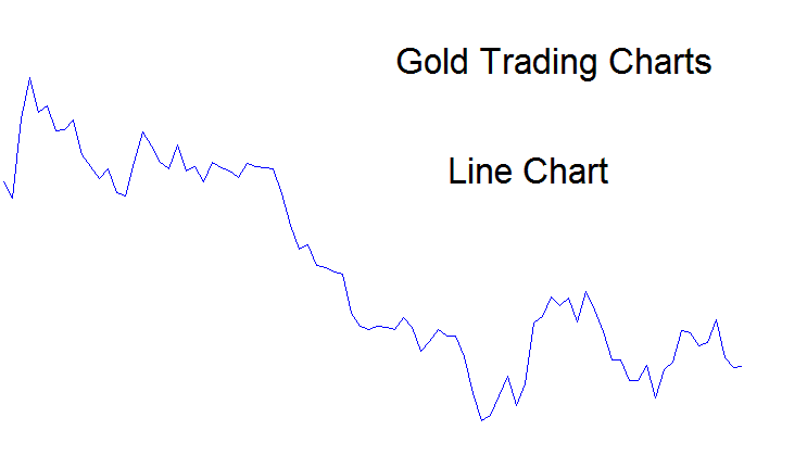
This chart type skips details on gold price moves. It only shows closing prices, not highs, lows, or opens. Line charts lack popularity among XAUUSD traders. Gold traders prefer bar or candlestick charts that include all that data.
Bar Chart
Bar charts will plot all the info about price info - this information is referred to as OHCL - Opening price, High of Price, Closing Price and Low of Price.
This data is shown as a bar. The bar charts have two colors: red when prices go down and blue when prices go up, and the bar chart is pictured below.
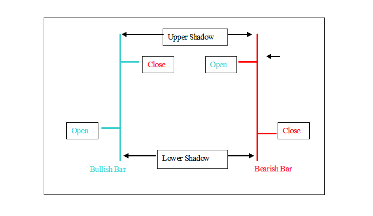
Bar charts show all price details like in the example. The vertical line marks total price change. The left tick shows open price. The right tick shows close price. Top and bottom points note the high and low prices.
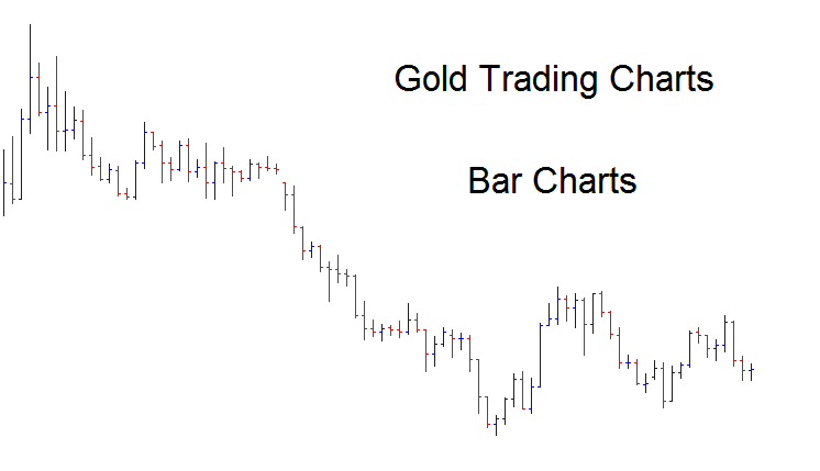
These charts do not look very good or easy to understand when they are placed very close together as seen below, and that's why these bar charts aren't often used for trading gold.
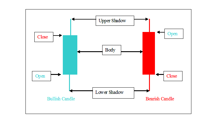
Candlestick Charts
These represent the chart formats encountered most frequently: they encapsulate all critical price data - OHCL - in a format that is easily decipherable. Candlestick charts utilize two distinct pigments: red signifies downward price movement, while blue indicates an upward price progression.
These candlestick charts feature candlesticks that have wicks at both ends. The candlestick body illustrates the variation between the opening and closing prices, while the highest and lowest prices are depicted by the shadows, which resemble candle wicks.
An example of how gold trading charts look is shown below:
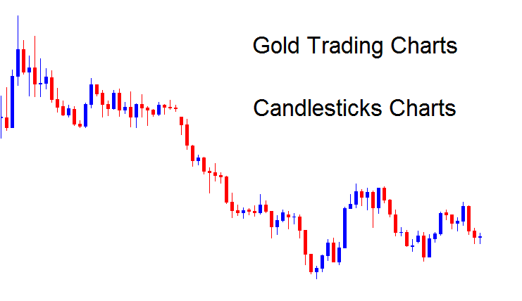
This is the most frequent used trading chart in trading gold.
A trader can switch between these chart types within the trading software by utilizing the buttons illustrated hereunder.
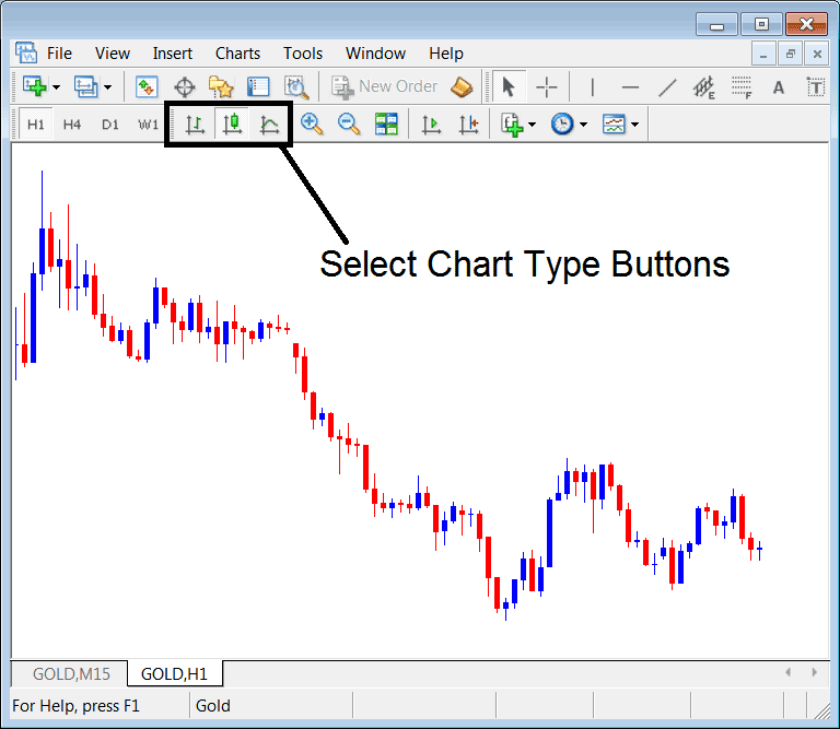
A trader has the capability to toggle between various chart formats by utilizing the controls situated above when executing xauusd trades.
More Tutorials:
- Moving Average MT4 Indicator
- How to Calculate Pips For SWI 20 Stock Indices
- Kurtosis MT4 Indicator on Forex Charts
- Explanation of the Balance of Power (BOP) Indicator
- Looking at Ichimoku XAU/USD tool in XAU/USD Charts.
- Identifying Buy and Sell Signals Using Bollinger Bands
- CAC Indices Methods
- Gann HiLo Activator XAU/USD Indicator Trading Analysis on XAU/USD Charts
- Interpretation of a 1:25 Leverage Setting for XAU/USD Trading
- Software Solutions for Trading