Momentum Forex Trends - Different Type of Market Technical Analysis
What's a Momentum Trend?
A momentum trend is one which has more momentum than the previous one, it can be plotted using a much steeper trend line than the one that was in place before. When a new line forms that's much steeper than a previous one we say that the trend has gained extra momentum & becomes much stronger. These types of trading setups require a different type of market technical analysis.
In the example below: Also when price is moving upwards within a channel, if it breaks the upward channel a stronger trend is formed as shown in the diagram below. If as a trader your chart breaks an upward trend line to the upside in an upward moving market like the one below, Do not Try to Sell, Buy More Contracts, Remember this Forex trading tip it can make you a lot of money just like the way it did in trading analysis below.
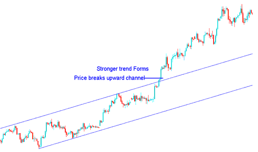
Channel Break Upwards - More Momentum on Upwards Market Movement
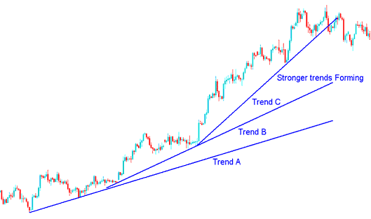
Using the same technical analysis examples above we can also see how new steeper lines were formed showing the currency was gaining momentum.
This is shown by the steeper lines that can be drawn as the price progresses.
The newly formed trend has more momentum than the previous one as shown by the formation of the steeper trend line.
This forms trend B and C as shown in the diagram below drawn using the MetaTrader 4 technical analysis software, The momentum added a new steeper line as plotted on this trading chart.
This is shown in the example below by the three lines A, B and C showing formation of stronger trends as the market continues to gather momentum.
Price Gaining More Momentum
However, when the steepest trend-line is broken then even all the others trend-lines will most likely be broken too. It's best to take profit once the steep most trend line is broken.
This strategy can also be used by short term forex traders like the day trader or the scalper, this pattern will frequently form on the 5 minute and 15 minute chart. This parabolic lines can be used to know where to take profit. A trader should immediately book his profit as soon as the steep most line is broken.
How to Trade These
The momentum Forex trend lines are good technical analysis tools for determining where to take a profit early before other traders. This momentum trading setup occurs frequently on 1 minute, 5 minute and 15 minutes trading charts & therefore suitable for scalpers & day traders. For day trading which is most common the best chart to use is the 15 minutes sometimes the 5 minutes, for example after entering a short term trade either buy/sell and the market moves some pips in your favor and you spot this pattern then it is best to exit once the steep most line is broken and take profit at that point.
Technical Analysis Examples
For this example we shall use short term chart of minutes for drawing, when the set-up appeared as below, it was a good point to take profit.
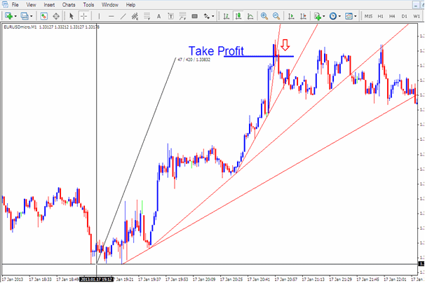
Trading the Momentum Market Moves
In the above example a trader trading long would have waited until the steepest line was broken then closed the trade and taking profit at this point thus making profit of 42 pips on this buy trade. Trader would have exited the trade at the best time & thus avoided the ranging forex market that followed.
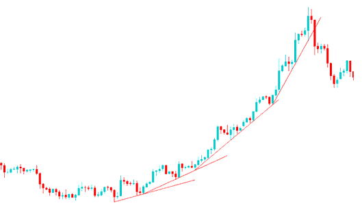
Parabolic Trends - What is it?
Sometimes a market moves in a parabolic manner, and this is seen when panic buying sets in and prices is driven vertical. During a parabolic up move, there is almost a complete absence of sellers, which creates a vacuum of buying. When this occurs traders rush to just get into the market regardless of price, in fear of being left behind. This can make the largest price moves in the shortest amount of time, traders will place buy orders in this setup.
For this type of move it is best to keep buying - no need for technical analysis just keep buying.
This trend will last for months on end even upto 2 years, for this time just keep buying and as long as those weekly & monthly trend lines are holding just keep buying and buying.
When a stock or currency moves in this way, the highest point that is reached often marks the end of a move with prices not returning to the ultimate highs again for a long time. When this point is reached and the most steepest trend line is broken it is best to consider that as a trend reversal and it is best to take time off the market and enjoy your profits for a while before calculating your next move.
The same can also happen for a downtrend when there is panic selling and price is also driven vertical. This especially happens during recession.
The steeper a trend line angle, the less reliable it becomes. When the most steep is broken its best to exit this trade. The example below is for crude oil that has formed a parabolic setup. Another example is gold that formed on the weekly/monthly chart during the period shortly after the steepest line in the crude oil chart was broken.
As a trader if you come across a parabolic trend in an upward just keep buying and buying some more you will make a lot of profits, there will be no added technical analysis required just the lines. The only thing to remember is to exit once the steepest line is over because the reversal on this setup is very fast you need to also be very fast. Just make sure you exit at the correct spot just like in the above example.
For example, the above parabolic movement is of crude oil trading chart, the traders had managed to drive the price of oil from $70 to $150 over a period of a couple of months at the top of the market those who call themselves analysts were so bullish they predicted the price of crude oil would hit a high of $200, what these analysts did not know this concept a.k.a Vacuum buying, in technical analysis market trading as long as the trend lines held the direction of the market was upward, but even after the first steepest line was broken the analysts kept insisting the price would hit $200, guess what, after the most steep line was broken it did not even take two weeks to take the price of oil, back to $50 at one time it was even $35. That is parabolic technical analysis, now you know.
Good examples of this setup on charts is the weekly and monthly price charts for Gold and Crude Oil, these charts can be found on MT4 software depending on your broker.